01
Finraly
Projects worked
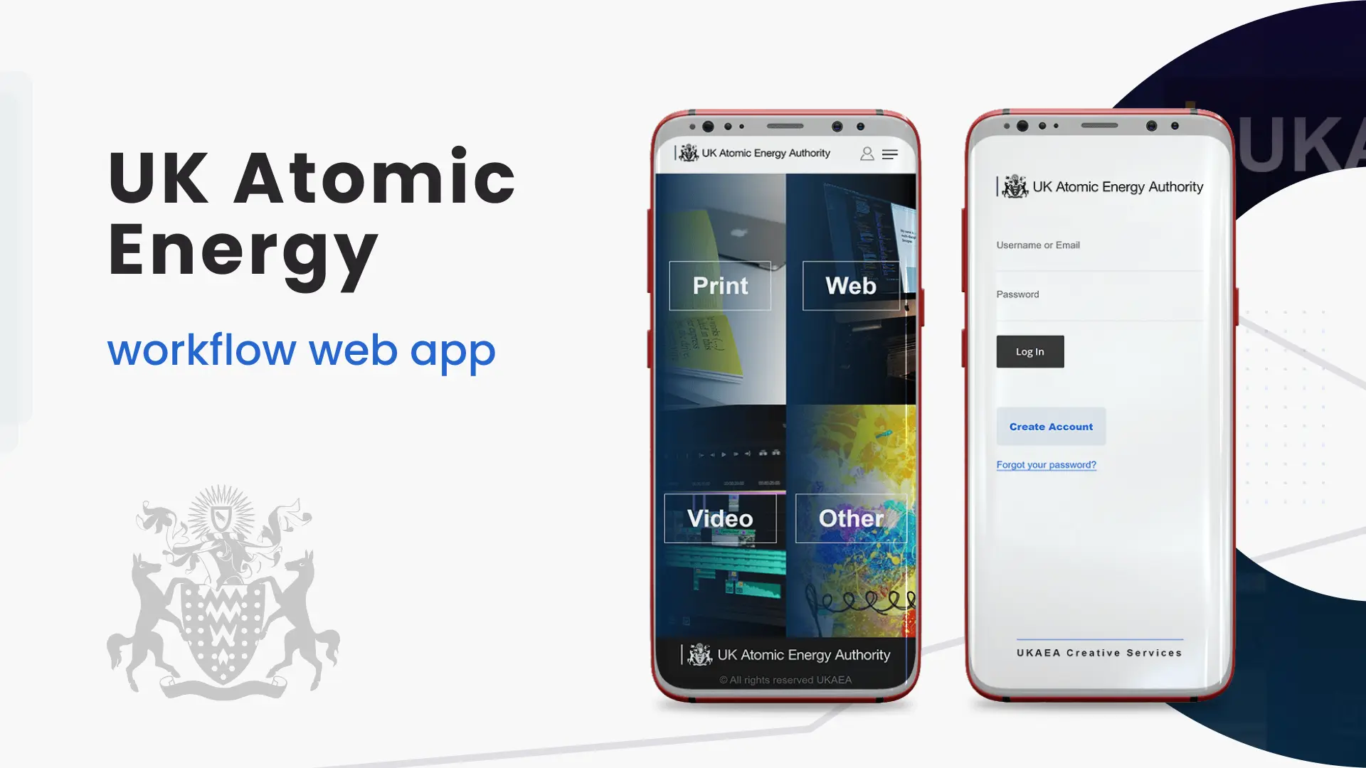
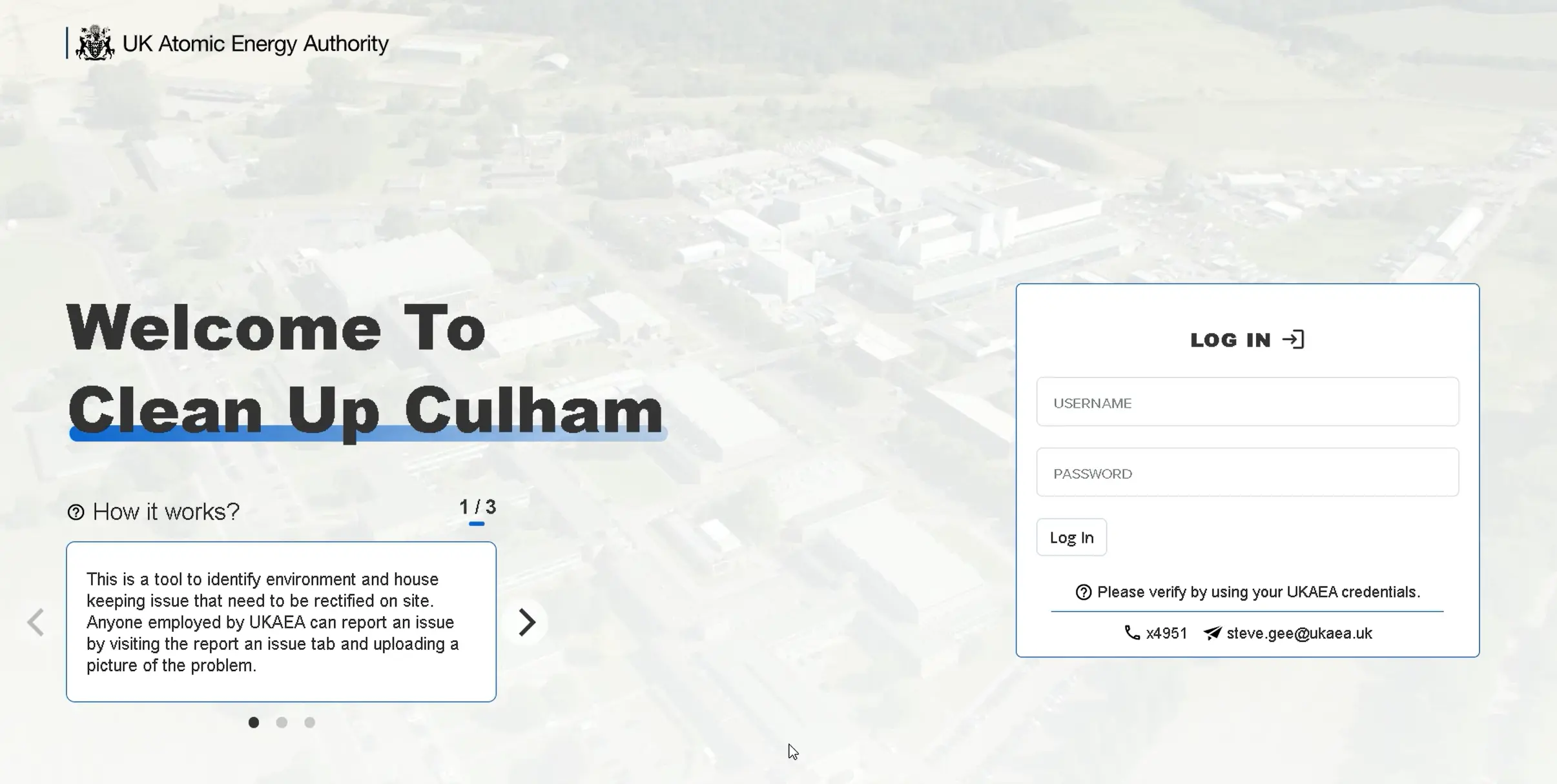
A comprehensive repsonsive web app, that reports and records potential incidents within the UKAEA facility.
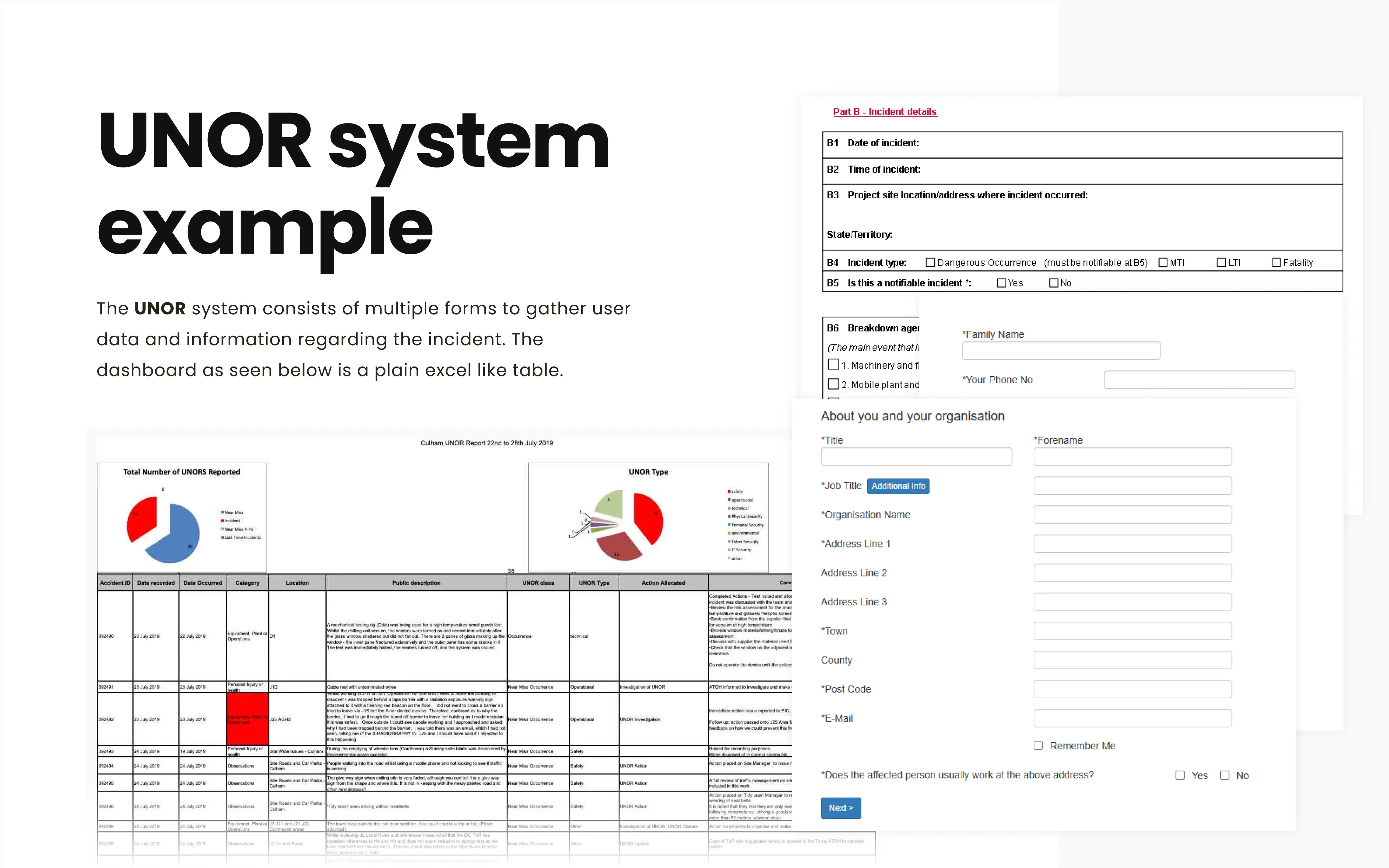
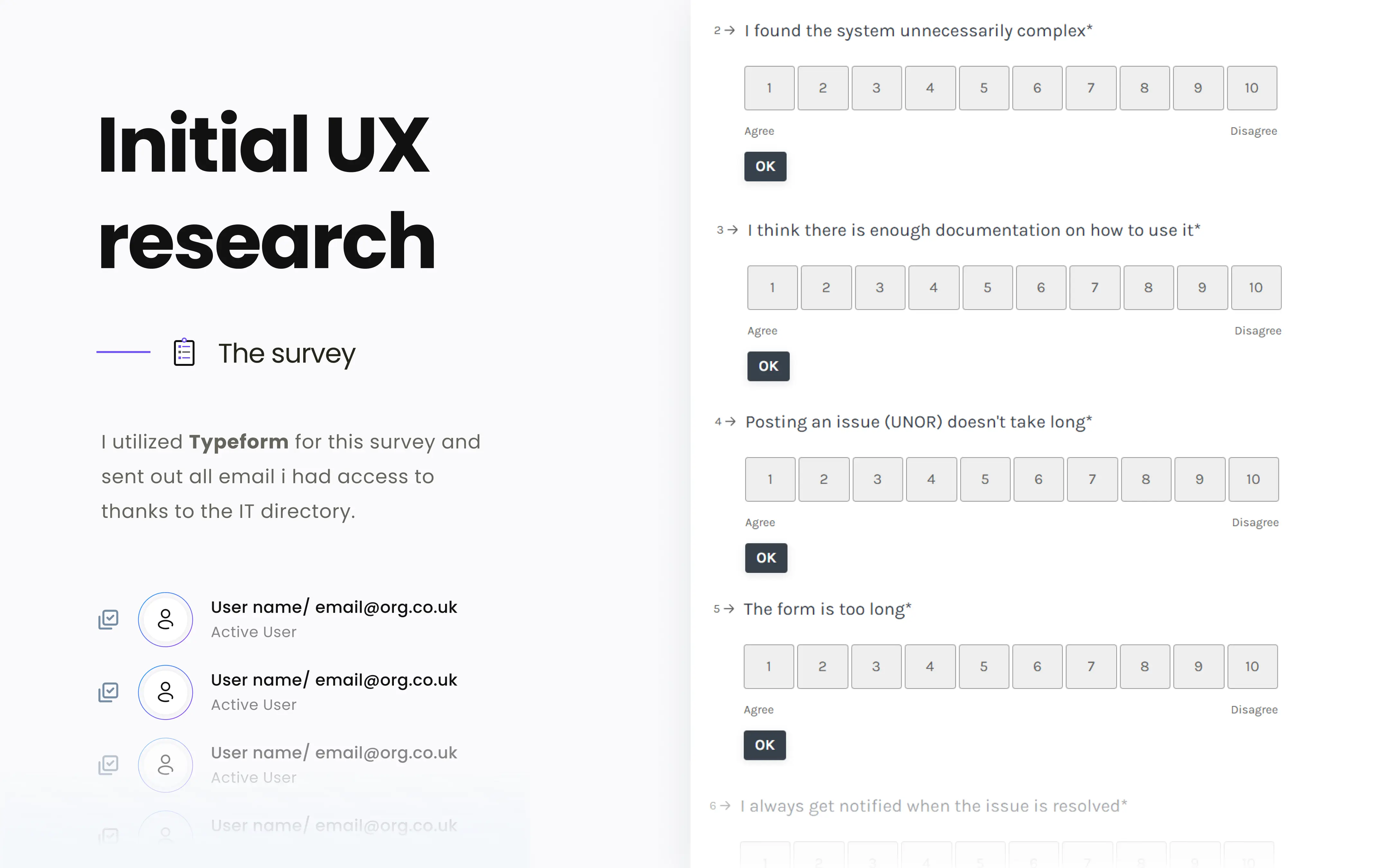
I was tasked to replace the old incident reporting system called UNOR because it was inefficient and rarely used. The UNOR system, a UK government form-based approach, collected incident reports manually. As a result leading to delays and potential financial losses.
Example of UNOR
Based on the findings from interviews with staff across the organization, I defined the design goals as follows:
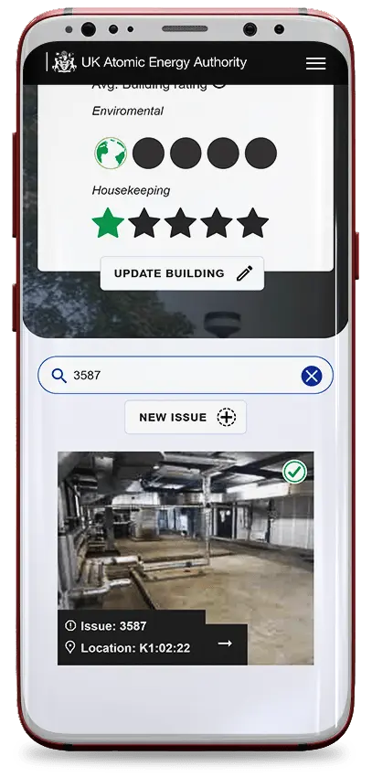
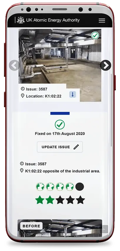
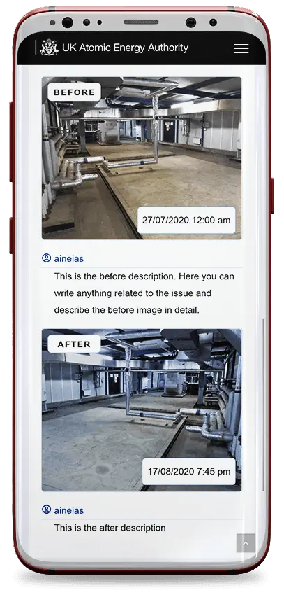
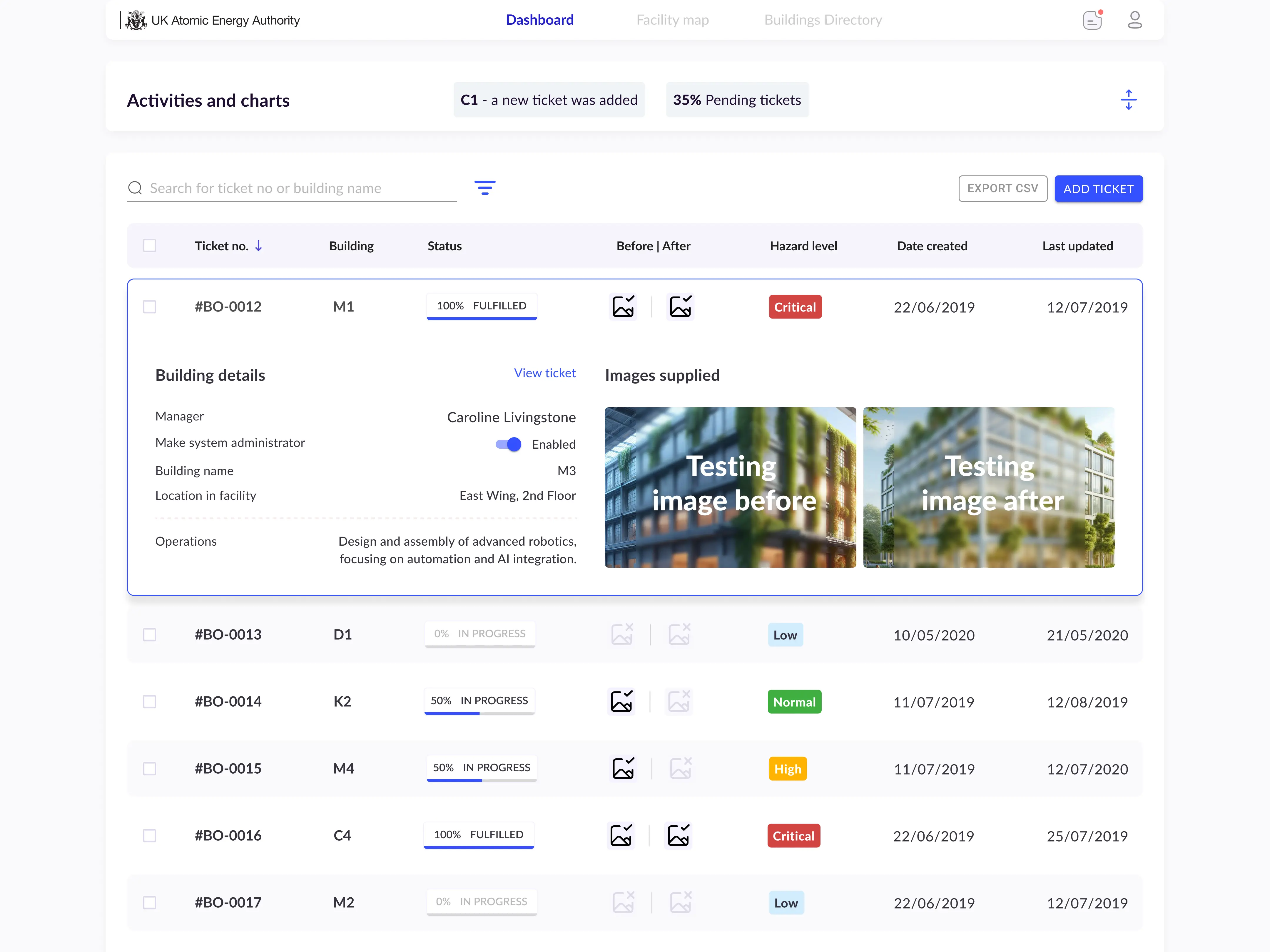
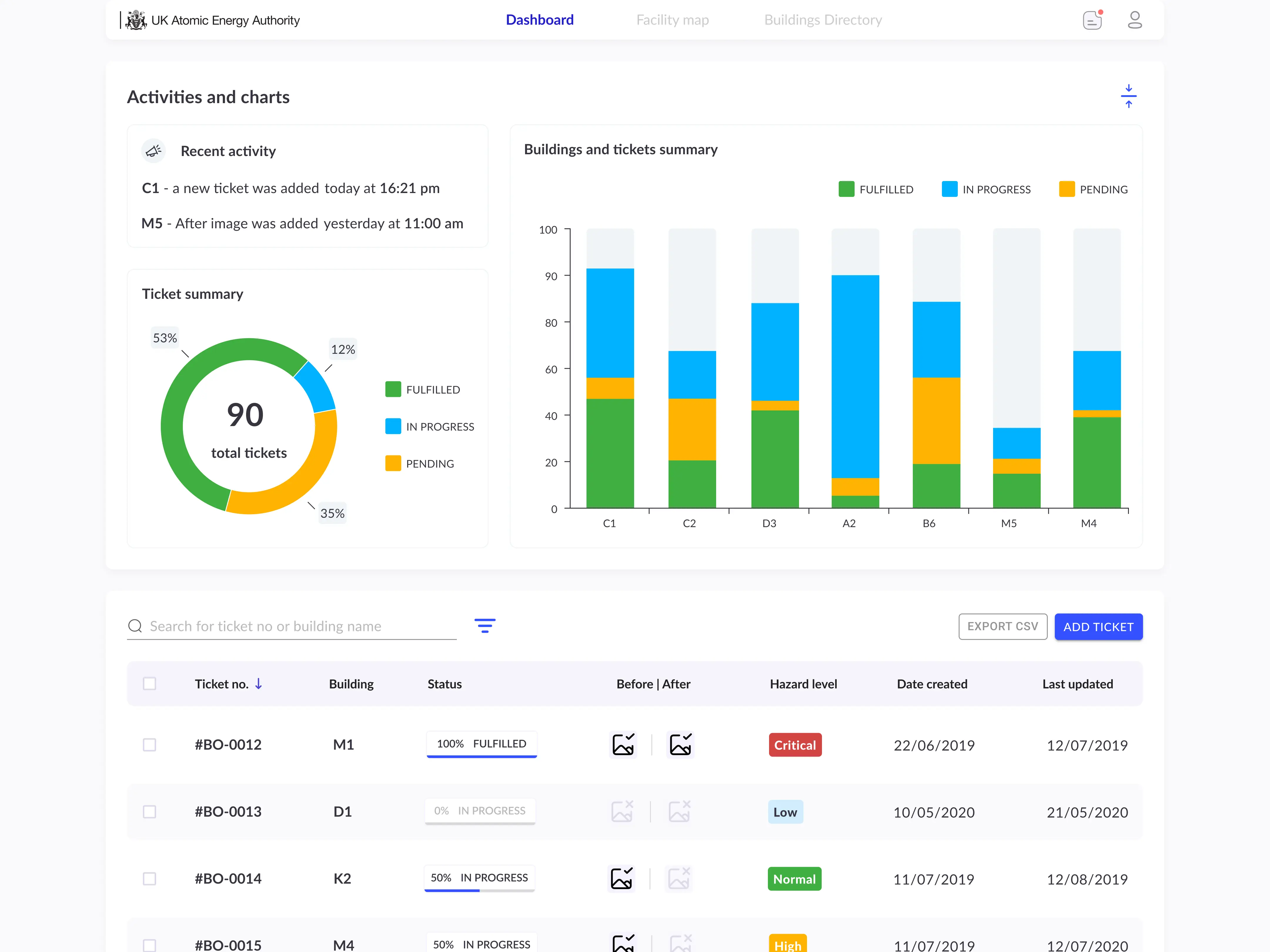
The solution I came up with was a two-level system: a front-facing interface that any facility user could easily access to report incidents, and a comprehensive dashboard for admins to oversee everything, make comparisons, analyze data, and more. Working on the dashboard was a lot of fun and required most of my focus since it’s the central control hub and has all the functionalities.
The web app passed with positive results, demonstrating the
            app's compliance with accessibility standards.
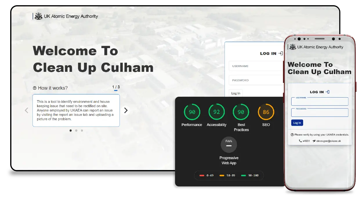
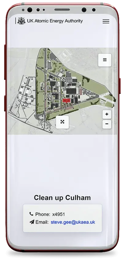
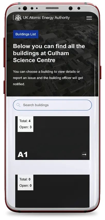
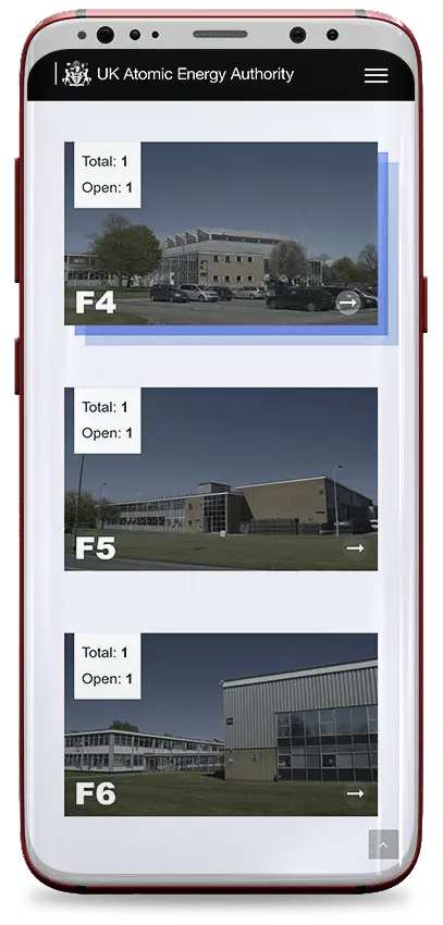
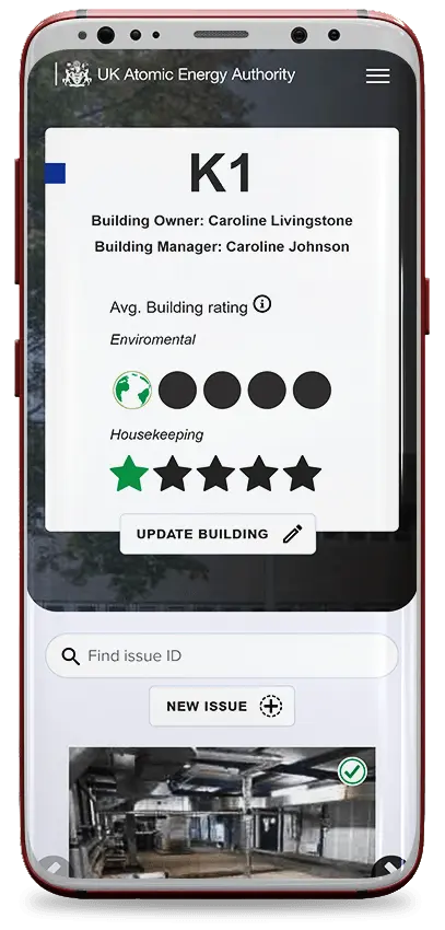
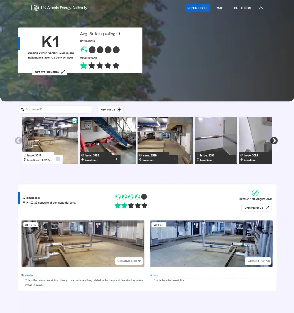
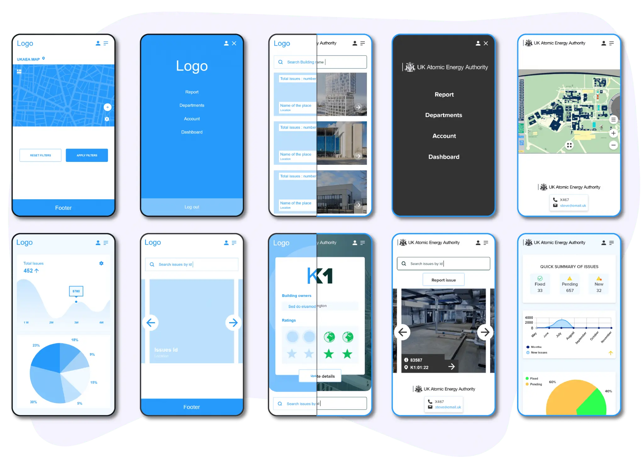
Front facing Smarthpone view
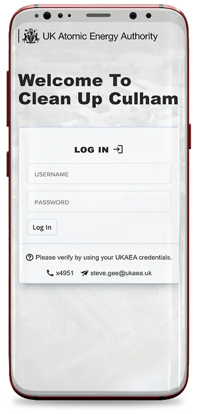
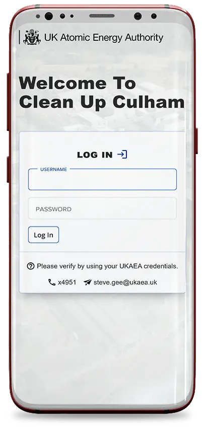
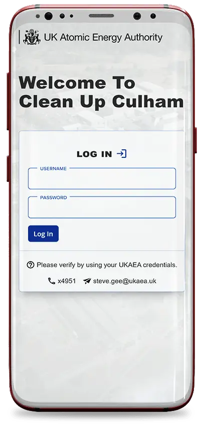
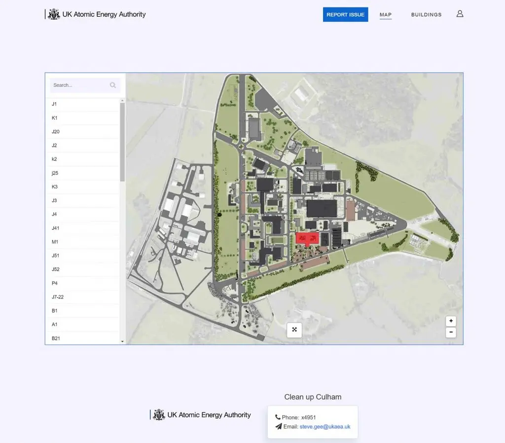
Front facing desktop view
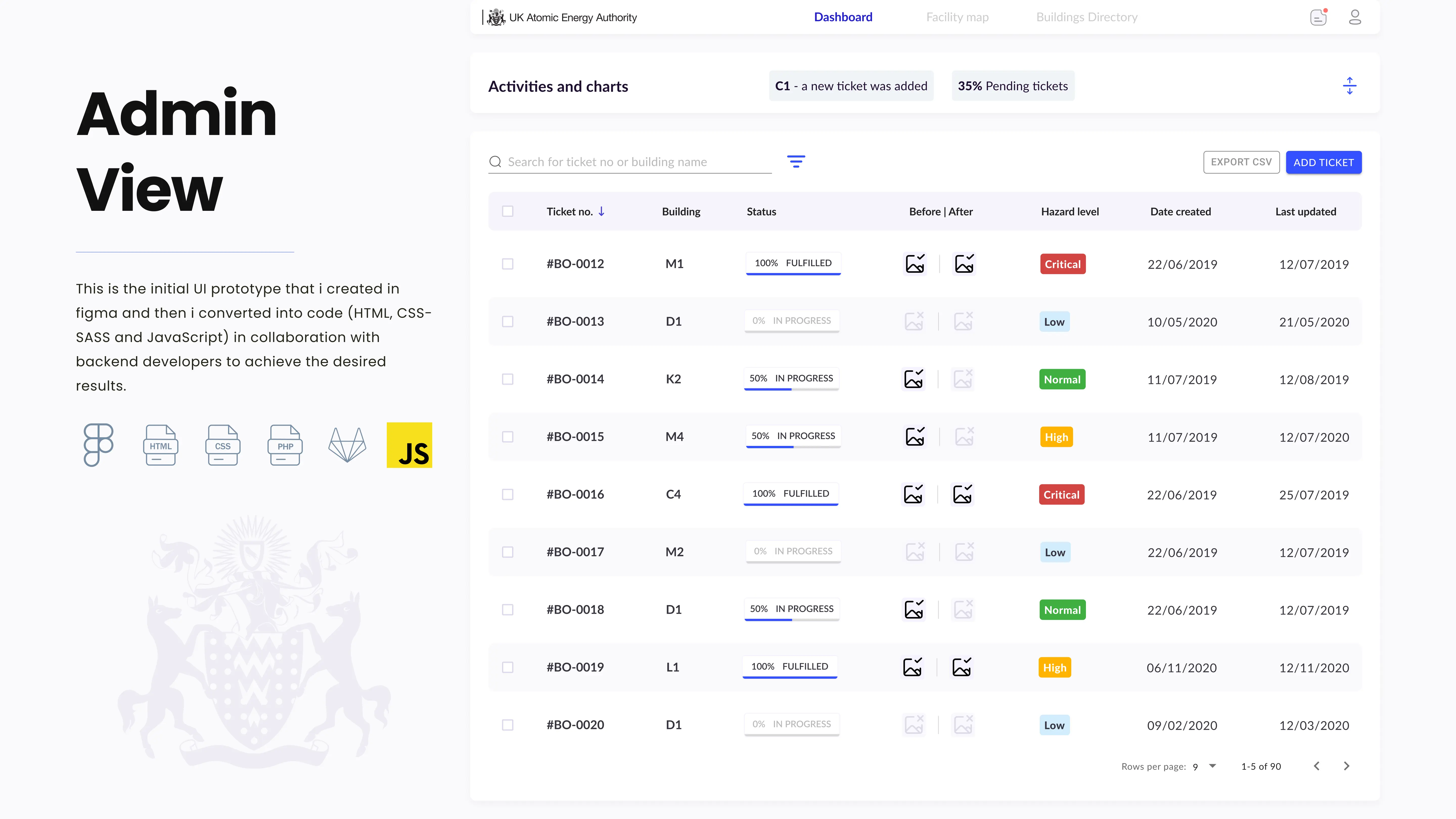
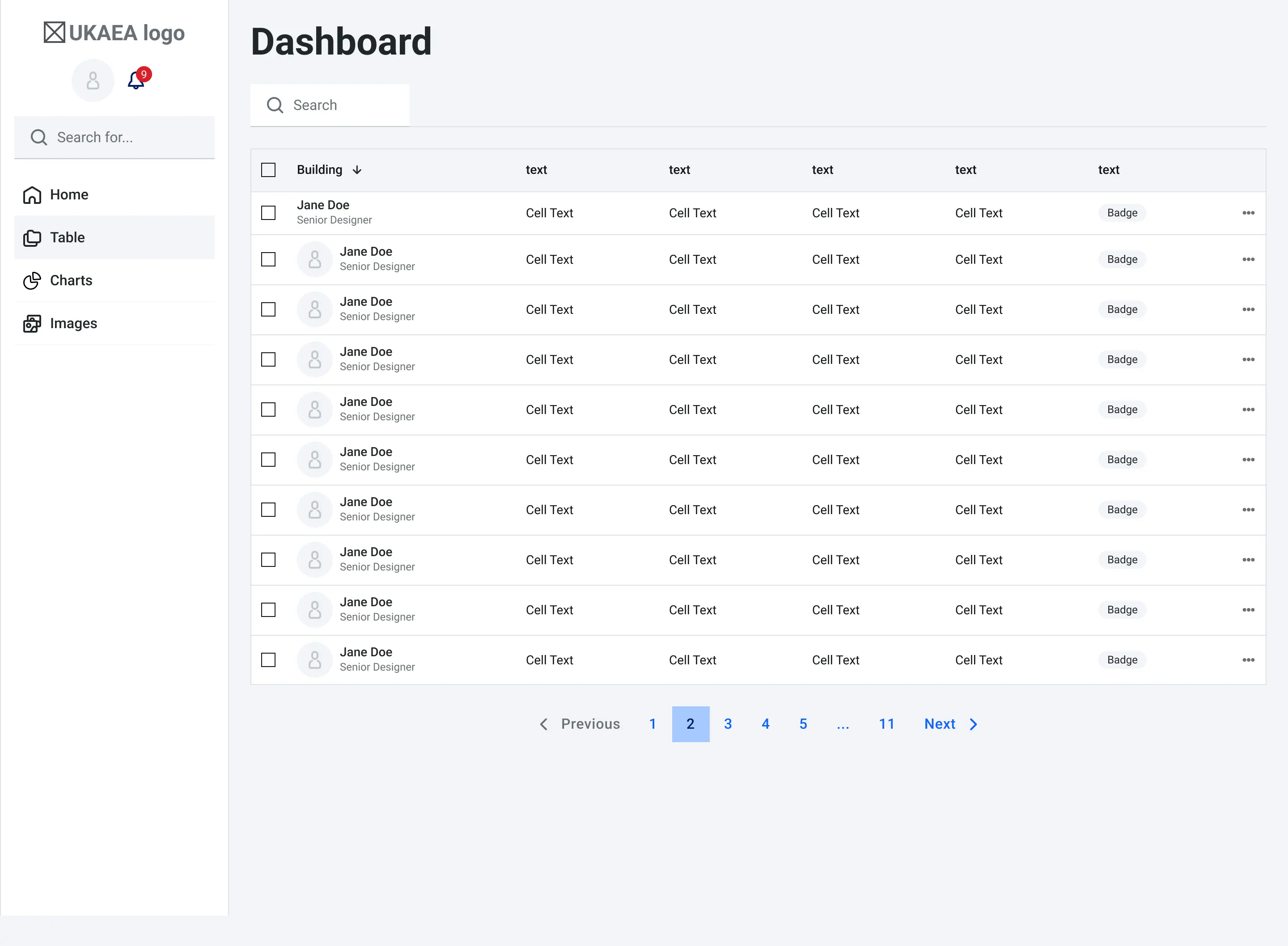
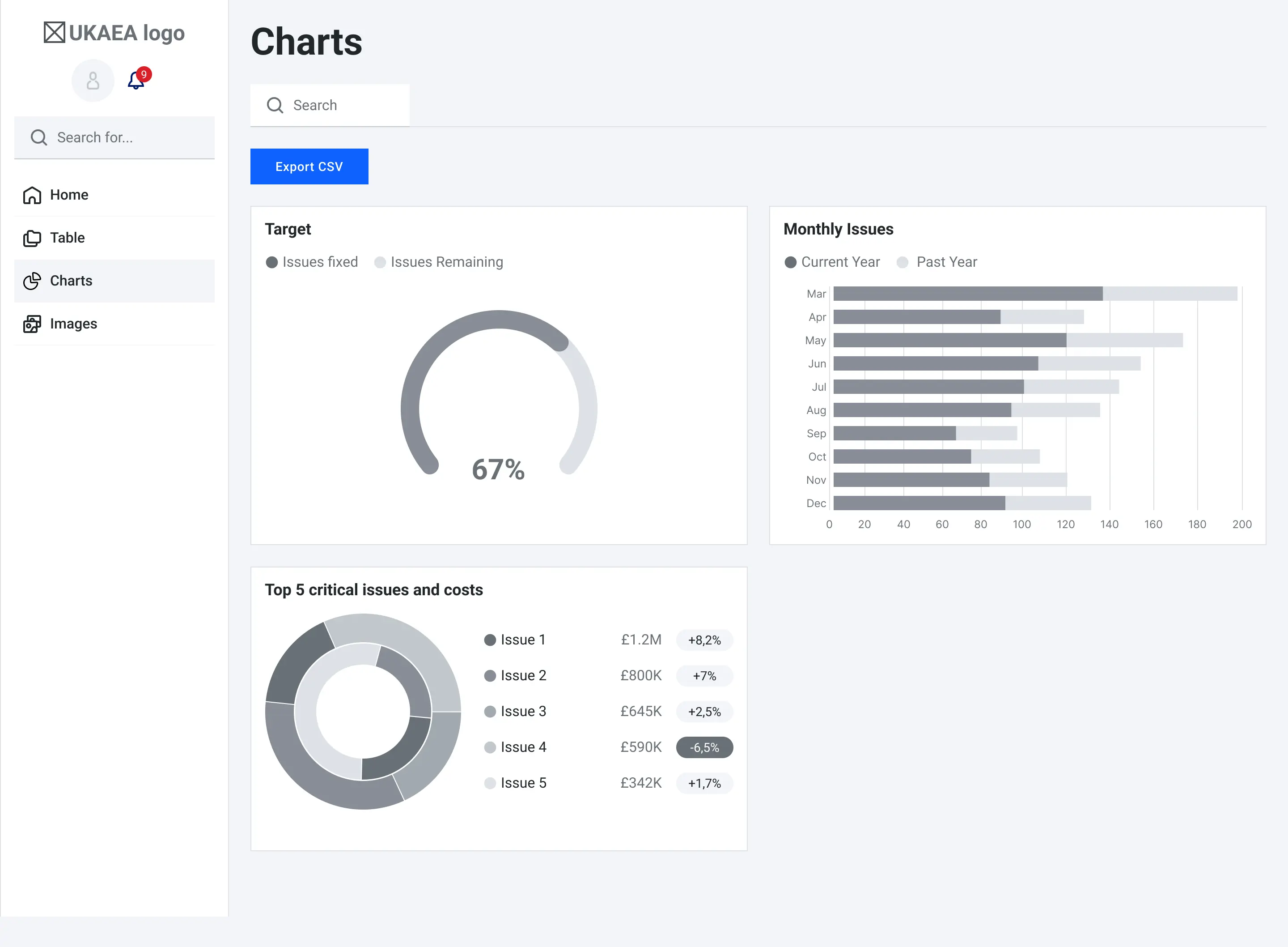
Here is the dashboard i created in figma then translated to code in collaboration with backend engineers where all the notifcations, images, user admin level and other functionalities exist. It is more of a control hub.
The admin dashboard hub
Below is the process i followed
To gain a better understanding of the problem, I employed a two-pronged interviewing approach. First i send out a survey to quantify my suspicions and second i selectively picked previous users who previously reported UNOR tickets and had a face to face chat (more of a qualitative interview).
This approach enabled me to gather a holistic perspective on the needs and pain points across the system and workflows. At the end i had a sample of 273 users that kindly replied to my survey and 12 interviews that validated my survey and supsicions.
Typeform
Results
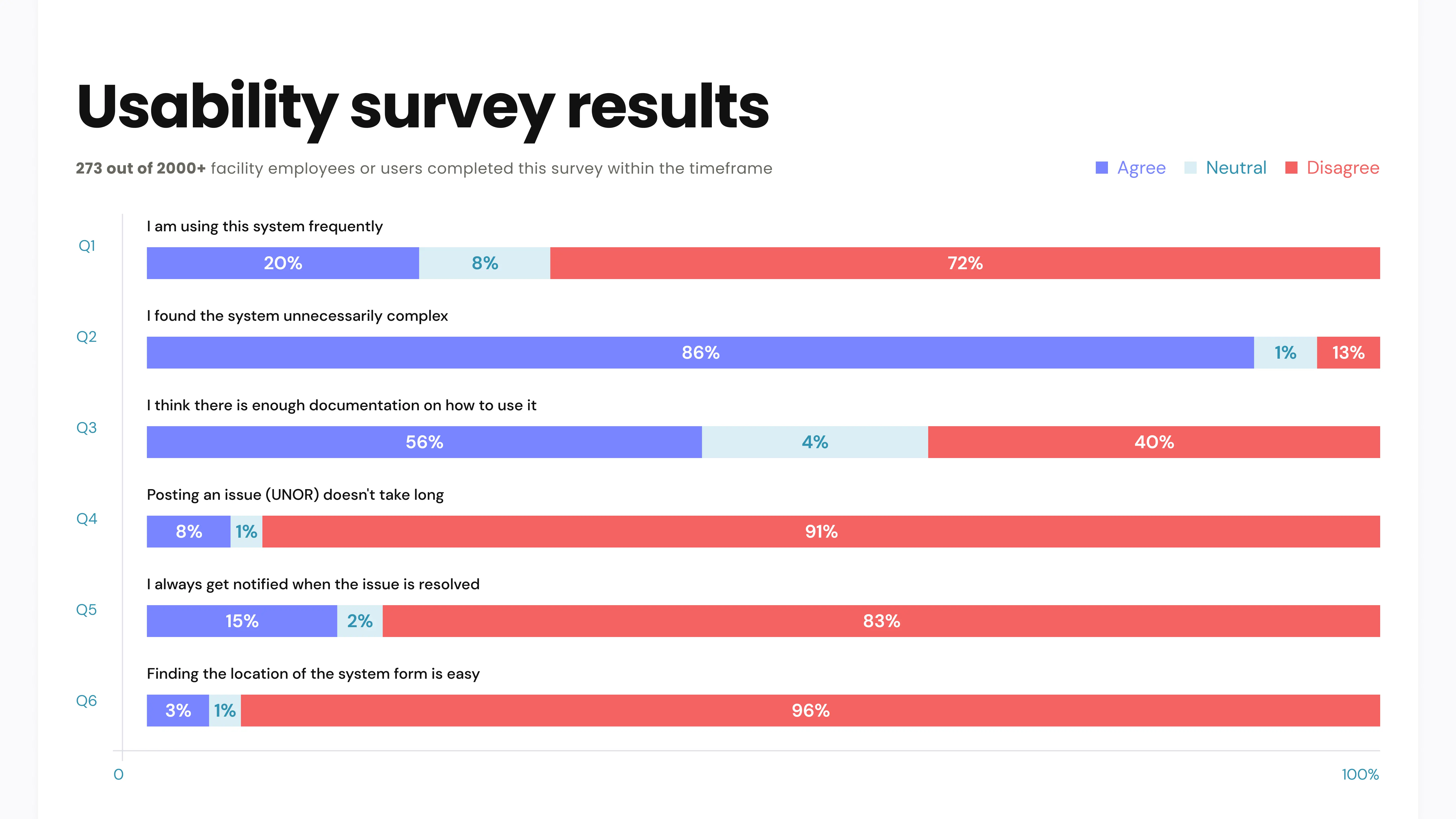
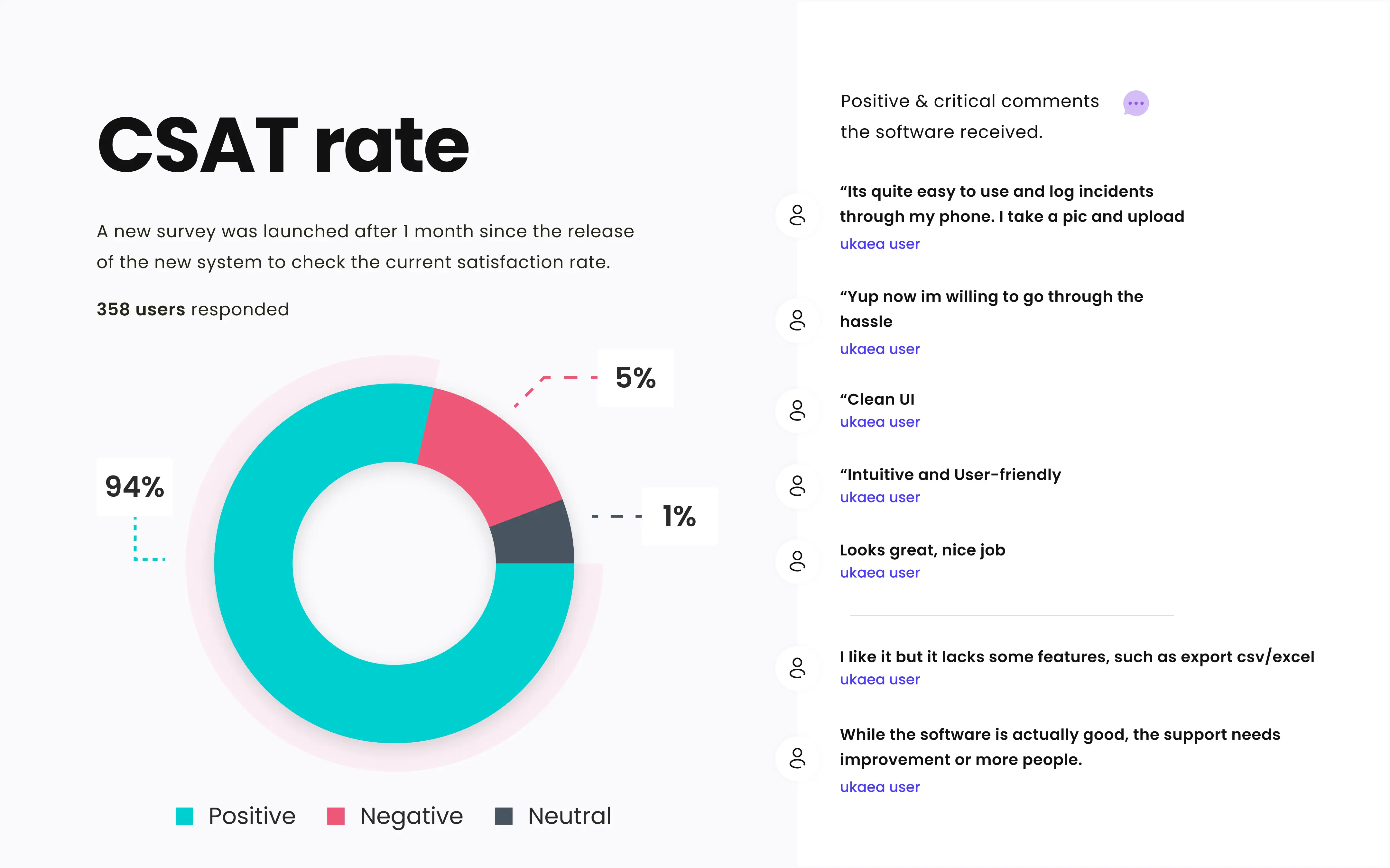
The conclusion suggests that many members want to use the reporting system , but have a hard time to find it and its too complex and confusing. This complexity stops users from moving furher with the ticket, thus making it time consuming and unnecessary.
Another significant finding was that the UKAEA incurred significant financial costs due to delays in reporting issues. Causing the govemernet facility to compensate individuals affected by the incidents and address the subsequent damages.
The key facts I had to take from the interviews were:
To visualize the entire interaction process, I created a initial flowchart, enabling me to identify key merging and breaking points. More like the initial idea or blueprints before moving to wireframes.
Flow model / first wireframes
Moving on to low-fidelity wireframes allows for iterating and refining ideas efficiently, without committing extensive effort to adding design libraries or achieving pixel-perfect detail at this stage.
By having these wireframes as a base enabled to me initiate discussions with backend developers to see what are the constraints. After multiple iterations it was time to add some colours and move to high fidelity prototype and designs, for this i used the existing design library that uk goverment has in all its services. Following this apporach it was very easy to communicate my solutions with key stakeholders, and after each feedback session, I incorporated more refinements.
Sample of initial wireframes of both for the front facing web app and admin app
Sample of library colours & icons
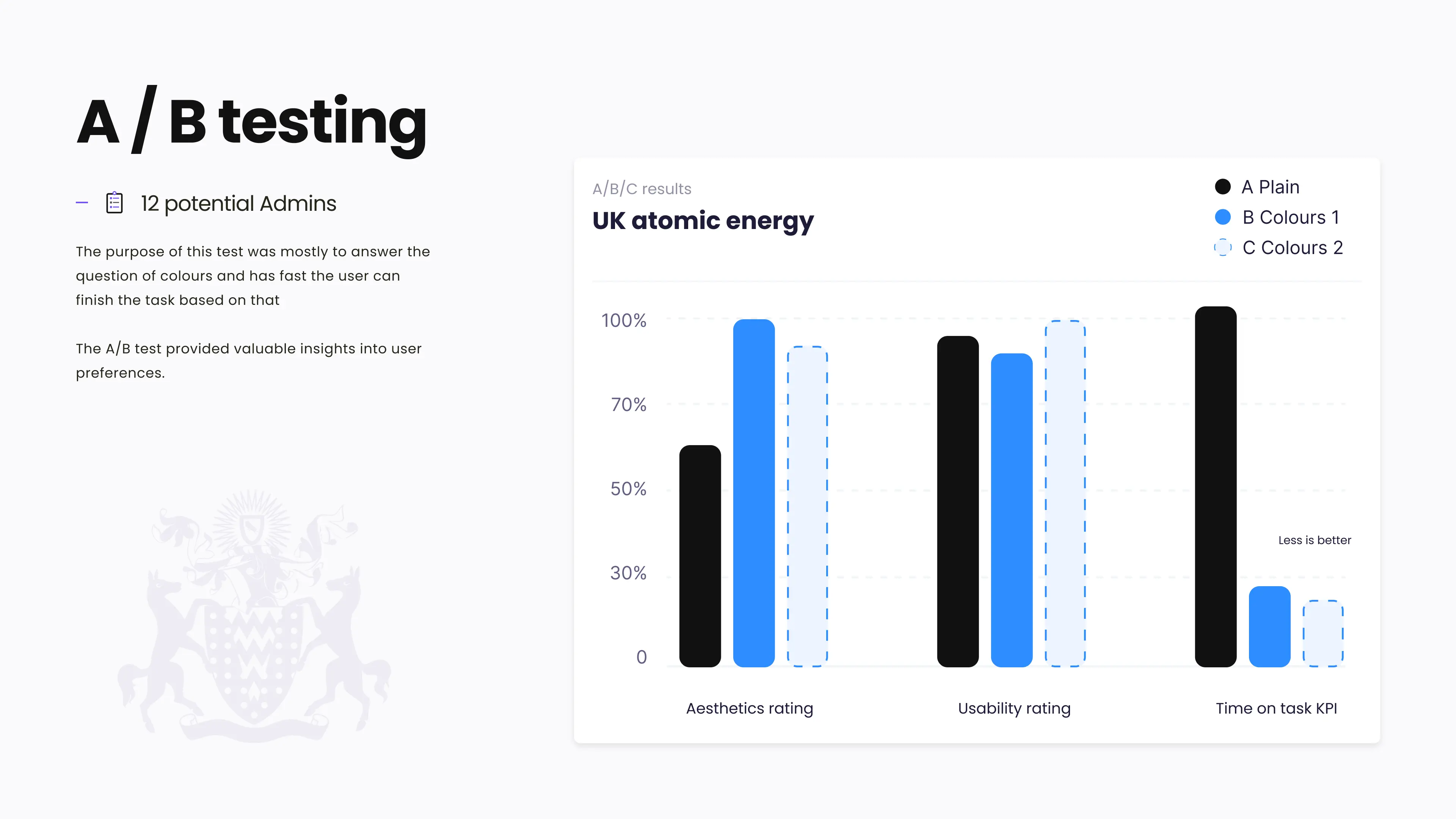
After i reached a 80% satisfaction rate with my designs, I wanted to make sure it was intiutive before diving into development. After all, it's way cheaper to test with design than with code.
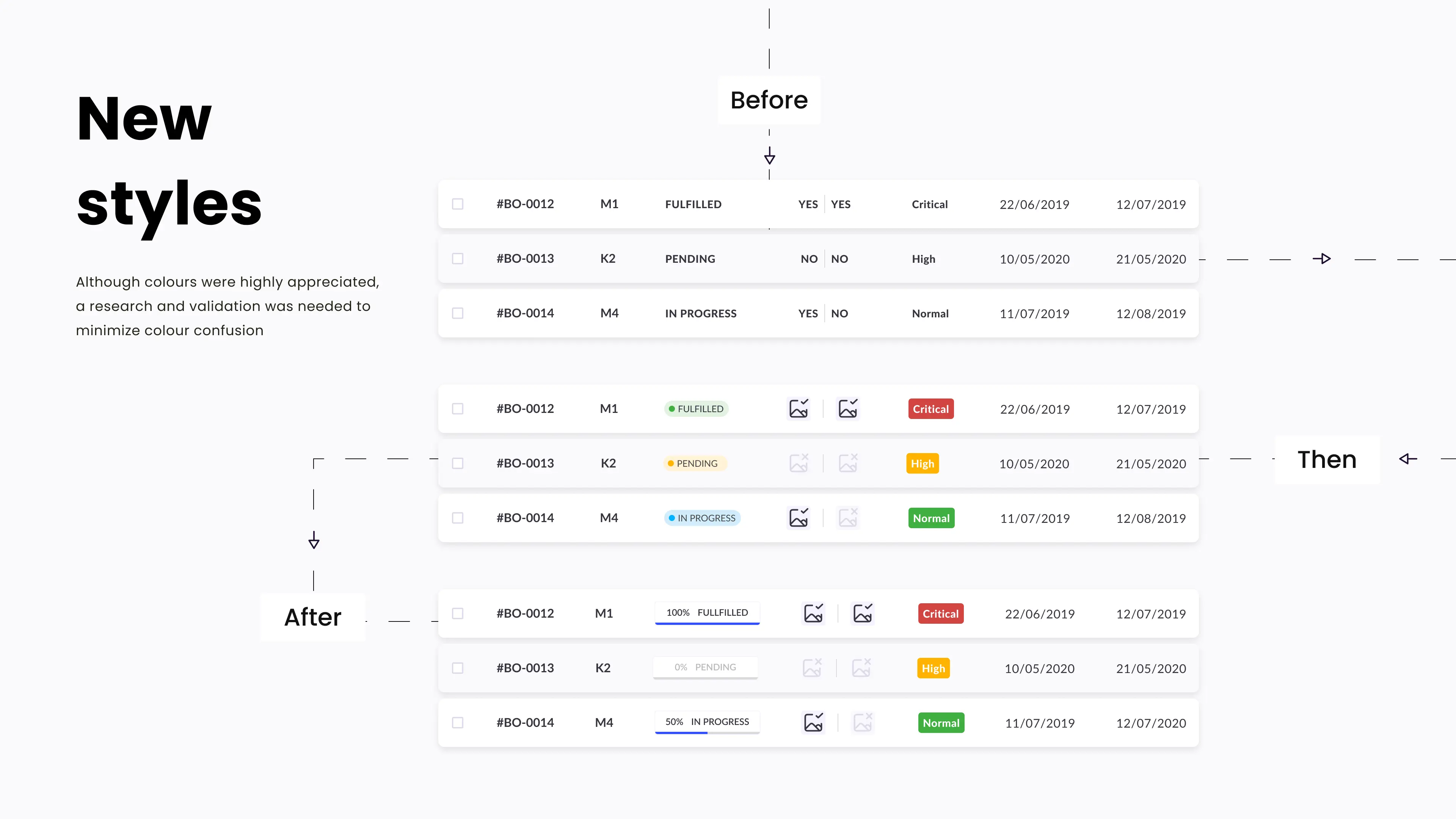
One area I specifically wanted to test was color usage. When new functionalities are introduced, excessive use of colors can potentially confuse users. The safety audit team required us to include hazard levels on the admin side. Our existing designs already used colors for ticket statuses, so we needed to ensure users wouldn't be confused by similar colors like red and yellow.
To solve this, I created a prototype with three versions: plain, colors 1, and colors 2. I shared the prototype with the UX researchers so they could run an A/B test and gather feedback on usability.
After the positive feedback I jumped into development mode. Having a multidiplinary background it was easy to translate UI designs into html/css(Sass) and javacript while collaborating with the backend developers via gitlab. We would always use the design libary and my designs as blueprints.
Our target wasnt to make it perfect, but we needed to release an MVP and gather further user data on how they use the system.
This way the product continues to grow and expands on functionalities while being user centered.The new system was added into the intranet and was promoted for all to be aware of it and how the new UNOR procedure will work. Hotjar and amplitude were attached and also documentation and support videos were provided.
After a month of usage i decided to roll-out a new survey to check the satisfaction rate