
01
GFK - Newron
Projects worked
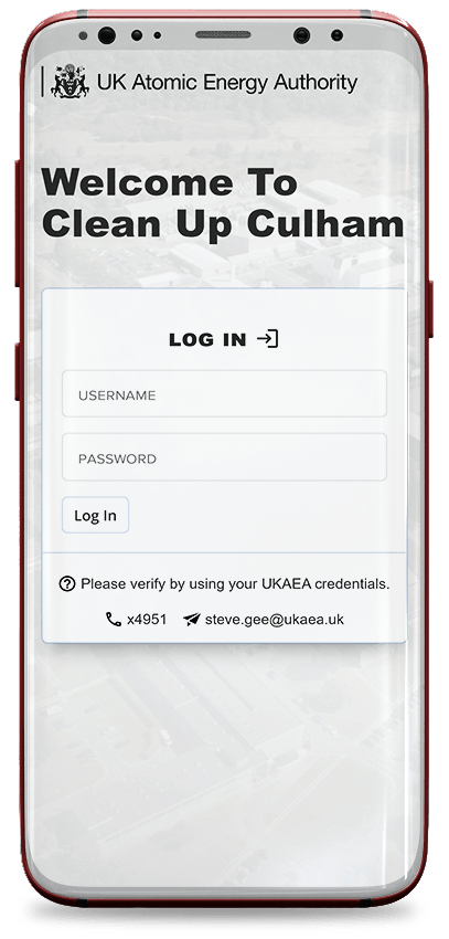
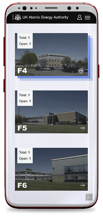
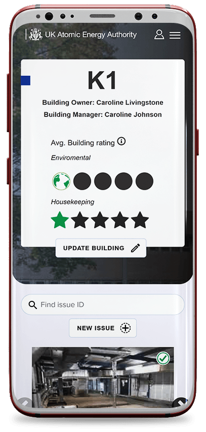
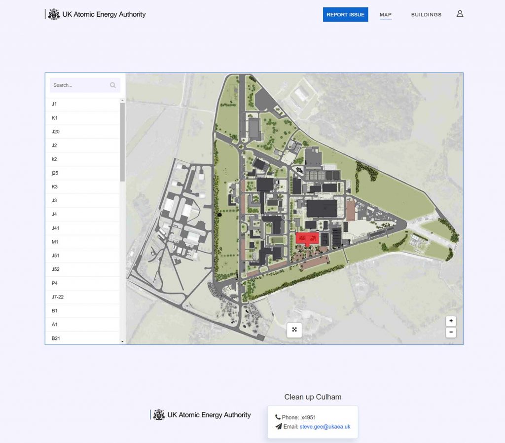
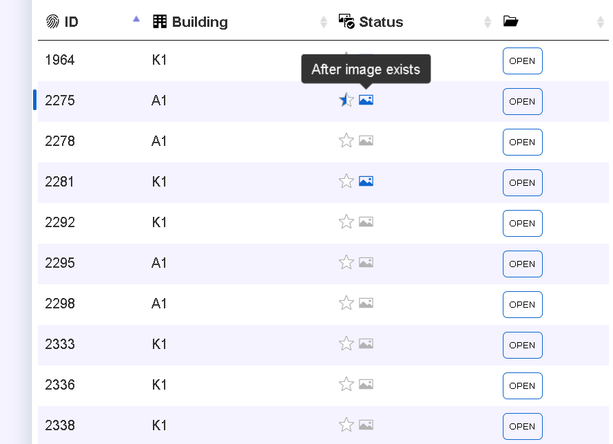
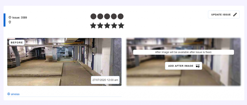
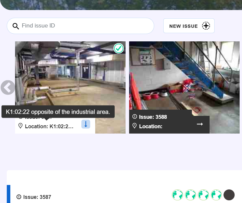
A safety web app to report issues within the UKAEA facility.
I was tasked with addressing a long-standing issue at the facility: the antiquated and inefficient UNOR reporting system. This outdated form-based approach hindered issue reporting, posing safety hazards and potentially leading to substantial financial losses.
More specific:
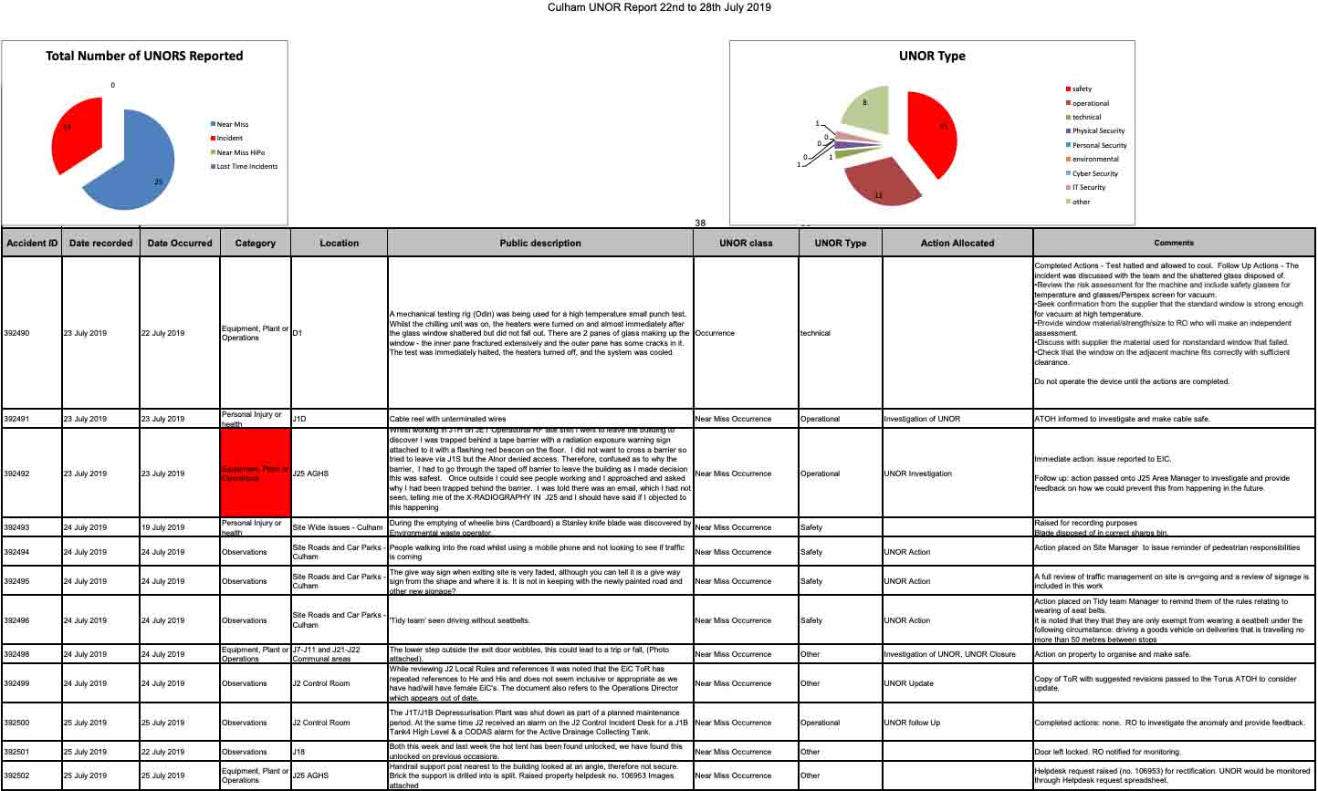
Example of UNOR
Based on the findings from interviews with staff across the organization, I defined the design goals as follows:
Implementing a unified reporting system is paramount to preventing accidents, keeping employees informed, and maintaining a comprehensive historical record for comparison and analysis.
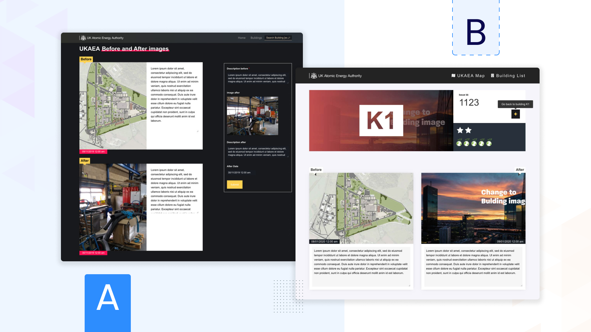
The web software yielded positive results, demonstrating the
            app's compliance with accessibility standards.

Fully responsive for every screen


To gain a comprehensive understanding of the problem, I employed a two-pronged interviewing approach: first, engaging in in-depth interviews with my department members, and second, randomly selecting employees from other departments who had previously reported issues.
This multifaceted approach enabled me to gather a holistic perspective on the needs and pain points across the organization. After each interview, I would synthesize the major findings and note them down.
A comprehensive survey of 20 employees from diverse roles (e.g building supervisors) revealed that a staggering 60% of staff members hesitate to report issues due to a lack of understanding of reporting procedures, the complexity of the multi-field reporting form, and time pressures.
The key facts I had to take were:
To visualize the entire interaction process, I created a comprehensive flowchart, enabling me to identify key merging and breaking points, thereby gaining a deeper understanding of the overall system dynamics.
Flow model
I adopted an iterative design process, commencing with low-fidelity sketches to capture the core concepts.
Subsequently, I refined the design to address specific user needs, utilizing Adobe XD / Figma to share prototypes with key stakeholders. Following each feedback session, I incorporated the valuable insights into the design, ensuring continuous refinement.
Sample of initial wireframes and UI designs

New design library colours & icons
I was pretty pleased with the design, but I wanted to make sure it was a hit before diving into development. After all, it's way cheaper to test with design than with code.
So, I whipped up an alternative version of the UI and set up a quick A/B test to see which one people liked better.

After every design being accepted I jumped into development mode. I took each design and started coding the templates focusing on responsiveness with HTML5, CSS3, Javascript while collaborating with a PHP backend developer on Github / Bit bucket repository.
This MVP allowed us to test the user experience through various other software e.g Hotjar and identify further painpoints.
This way the product continues to grow and expands on functionalities.


